Future Dusk—Color of the Year 2025 And Its Potential For Handmade Jewelry
Every year, the design world eagerly anticipates the announcement of the Color of the Year, a forecast that offers a glimpse into the future of trends across multiple industries. WGSN and Coloro, two influential forces in trend forecasting and color science, lead the charge in revealing these annual predictions, being the first to announce an inspiring color for each year much ahead of Pantone, the reigning color guru.
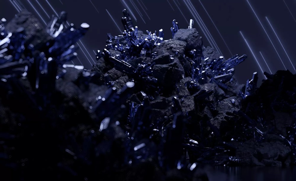
Image from WGSN
For 2025, these two powerhouses have named "Future Dusk" (Coloro code 129-35-18) as the Color of the Year, along with a supporting palette of complementary hues. This decision is based on extensive research and foresight into cultural shifts, technological advancements, and consumer behavior. As we dive into this captivating color, we’ll explore how it may influence jewelry design, and how bead colors from our offer reflect its depth and beauty.
What is Future Dusk?
Future Dusk is a dark, moody hue that resides between blue and purple, carrying a sense of mystery and intrigue. Its rich tones tap into themes of escapism and transformation, resonating with a collective desire to explore new frontiers, both in the physical world and in digital spaces.
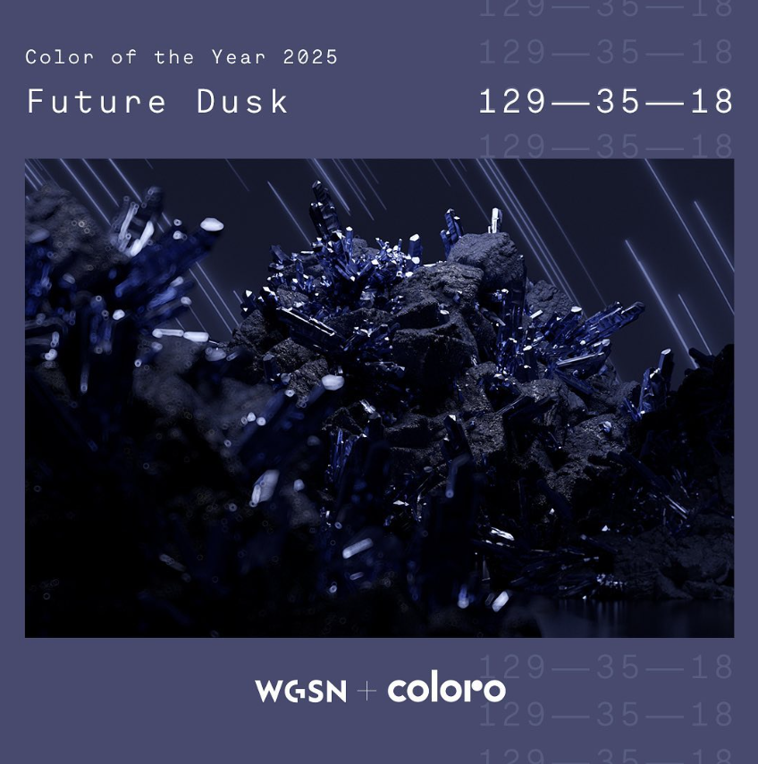
Image from Coloro's Instagram
The celestial appeal of Future Dusk connects to the growing influence of space exploration and the so-called "second space age." Its connection to the futuristic and surreal is further deepened by the increasing role of artificial intelligence and technology in creative fields, with tools such as AI-generated art blurring the line between reality and fantasy. In this context, Future Dusk is seen as a color that represents both stability and innovation—a comforting yet forward-looking choice that fits perfectly with evolving consumer desires.
This hue also reflects a broader trend towards colors that transcend traditional seasonality, making it an ideal choice for timeless beautiful pieces. It works equally well in classic and cutting-edge designs, offering opulence when paired with metallic or vibrant finishes.
A Look at Preciosa Ornela’s Inspirations
Our friends at Preciosa Ornela, known for their innovative glass beads and components, are always ahead of the curve when it comes to color trends. Already in October, they are ready with designs and inspirations that echo the mysterious, transformative essence of Future Dusk.
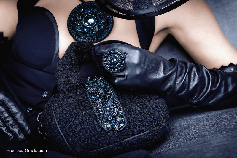
Photo by Preciosa Ornela, featuring designs by Alexandra Lysenko
From deep dark blues to serene cool purples, their ideas embody the rich, enigmatic qualities of this color.
Which Bead Colors to Represent Future Dusk?
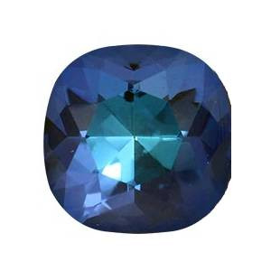
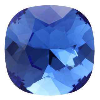
For jewelry makers and beaders, finding the perfect shades to reflect Future Dusk can be a journey. There are so many shades and finishes that finding the best matches may take hours! We went through our catalog for you and chose the bead colors that match or complement this moody hue, offering a world of creative possibilities for your designs:
Iris Blue

Frosted & Semi-Glazed Navy Blue
And our top choice:
The Supporting Palette for 2025
Along with Future Dusk, the color experts at WGSN and Coloro have released a palette of hues for Spring/Summer 2025 that will perfectly complement Future Dusk. These colors, each with their own unique qualities, create a balanced and dynamic framework for design, offering opportunities for contrast and harmony when paired with the Color of the Year:
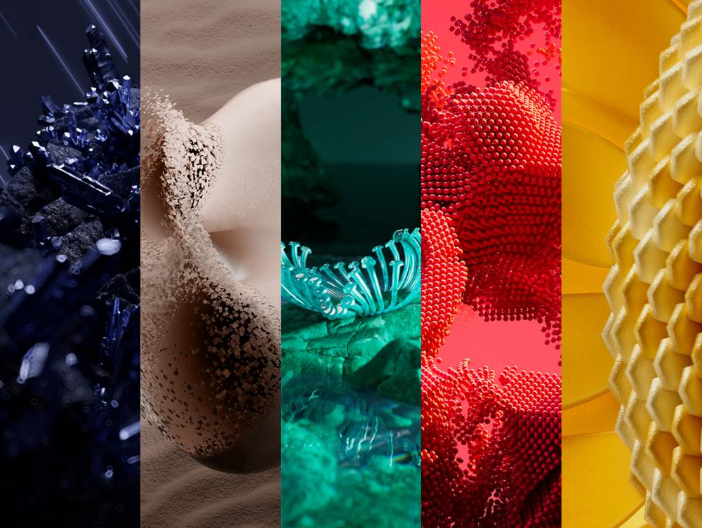
Image from WGSN
Transcendent Pink: A soft, barely-there pink that feels more like a neutral. This versatile shade offers a grounding presence, balancing the darker tones of Future Dusk.
Aquatic Awe: A transformative turquoise that celebrates both the natural and the synthetic, reflecting the growing influence of digital and virtual worlds.
Sunset Coral: An energizing and joyful shade that encourages slowing down and savoring life’s pleasures, perfect for adding a playful touch to your designs.
Ray Flower: A radiant, warm yellow inspired by regenerative practices and sustainability. This optimistic hue brings light and energy to the palette.
What’s Your Take?
Now that you’ve explored the beauty and depth of Future Dusk, what do you think of WGSN and Coloro’s choice for the Color of the Year 2025? Will you be incorporating this moody, celestial hue into your jewelry designs, or are you waiting for Pantone’s announcement in December?


